Mistake 1: Excessive Use of Sliders, Carousels or Tabs
I’ve got to say, sliders DO look good and putting information in tabs DOES make browsing easier.
The only problem with them is they do nothing to make users look at anything but the first slide or tab. Most people never go beyond the first slide before scrolling away.
This means everything you put on slider number 2, 3 and so on never gets seen. You might be using the slider as a promotional tool, which means you’ve just wasted a few pages of promotional material. If you’re using the slider to provide information about your product or service, you’ve failed to impart that knowledge.
How to avoid it
The obvious thing would be to not use sliders at all. Design something that doesn’t need a slider to do the job.
If you’re using a slider or tab because you have a large amount of content and don’t want to make the page too long, then I recommend you stick to a slider/tab. Here are a few things you can do to help:
Write a clear heading and description before the slider/tab section.
This should explain what information is in the section and why visitors should click through it.
Use tab headings or thumbnails on your slider.
You could put a couple of words that define what each slide is for. This way, a quick glance would reveal a basic summary of all the contents of a slider.
Use HTML5 animations to catch their attention.
An animated floating arrow has a much better chance of being clicked than a boring slider arrow.
Mistake 2: No ‘closure’ at the end of a transaction
A ‘transaction’ on your website could be anything from the purchase of a product to signing up for a newsletter. A big mistake some websites make is not providing a clear message at the end of the transaction. All you see is a simple box with vague content. This leaves the visitors confused and whatever action you wanted them to perform from there is not likely to get completed.
How to avoid it
Make sure you have a well-designed completion box and well-written message at the end of each transaction. If you want to go with a whole ‘thank you’ page, go for it.
The goal is to make sure the visitor knows exactly what just happened and what they’re meant to do from here. It doesn’t hurt to sneak in a little gratitude for their customers by putting up a nice web animation on the thank you page!
Mistake 3: Unclear Navigation
A lot of websites are guilty of this. Once a visitor gets in, they don’t know where to go. Some menus are just badly designed while sometimes they are victims of ‘too much design’. You need to make sure your visitors are totally comfortable with navigating your website or they’ll be navigating to the close button pretty quickly!

How to avoid it
Here are some things that instantly make your UI/UX more appealing and easier to navigate:
Coordinate your buttons.
Make sure the more important and highly used buttons stand out from the other ones. You can do this by changing their colors, design or sizes.
Group together relevant navigation items.
If you have menu items or buttons that are relevant to each other or perform similar actions, make sure they’re grouped together. For example, in a document database, the ‘Archive’ button would be next to the ‘Delete’ button while the ‘copy’, ‘print’ and ‘send’ buttons would be grouped together.
Highlight the right elements.
Make sure you avoid giving too much importance to an unimportant element. A non-clickable sticker shouldn’t stand out more than your main call-to-action button.
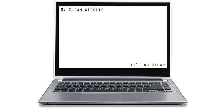
Mistake 4: Falling for the ‘clean feel’
It’s no secret that a clean, easy-to-read website works much better than a website full of clutter. A lot of website owners ask for a ‘clean feel’ for their website. In the drive to make their website simpler, people skip out on important information and fail to give importance to parts of their website that matter. To them, going for a clean look means losing any personality their website design has and boring their visitors to death!
How to avoid it
Here how you can stay clean but still be interesting:
Use images and graphics where you can.
They don’t have to be over-the-top. Nice and simple images would still attract more attention.
Use a different color on your CTAs.
Green or orange might not go with your website design but statistically, it’s got a much better chance of being clicked on than a bland color.
Highlight important sections
Use HTML5 Animations and Adobe Edge animations to highlight sections that are important. They don’t have to be full-scale animations, subtlety goes a long way.
That’s all the design tips we have for this time. All of these are tried and tested by the best minds in online marketing and I hope they work for you as well as they’ve done for me over the years.
Please leave your feedback and suggestions in the comment section and let me know if they helped.

2 Comments. Leave new
Oh my goodness! Amazing article dude! Thanks
What’s up very cool website!! Man .. Excellent .. Superb
.. I will bookmark your web site and take the feeds additionally?
I am happy to seek out so many helpful info right
here within the post, we need to develop more techniques on this
regard, thanks for sharing. . . . . .